
.svg)

.png)



WeChat • Contacts Manager
Relieving your social pressure and expressing yourselves freely by efficiently organizing your contacts.
Holder
type
Duration
Tech
initial status
end status
my role
my work
User research
Information architecture
User flow
Interaction design
Visual design
Usability testing
Cross-functional teams communication
work directly with
2 Windows Engineers
2 Mac Engineers
1 Testing Engineer
Report directly to
Design Director
Product Team Leader
Product Director
2 Engineering Team Leaders
A summary of WeChat and my team.
logo

ownership

launched
summary
key features
comparable to



monthly active users
demographics
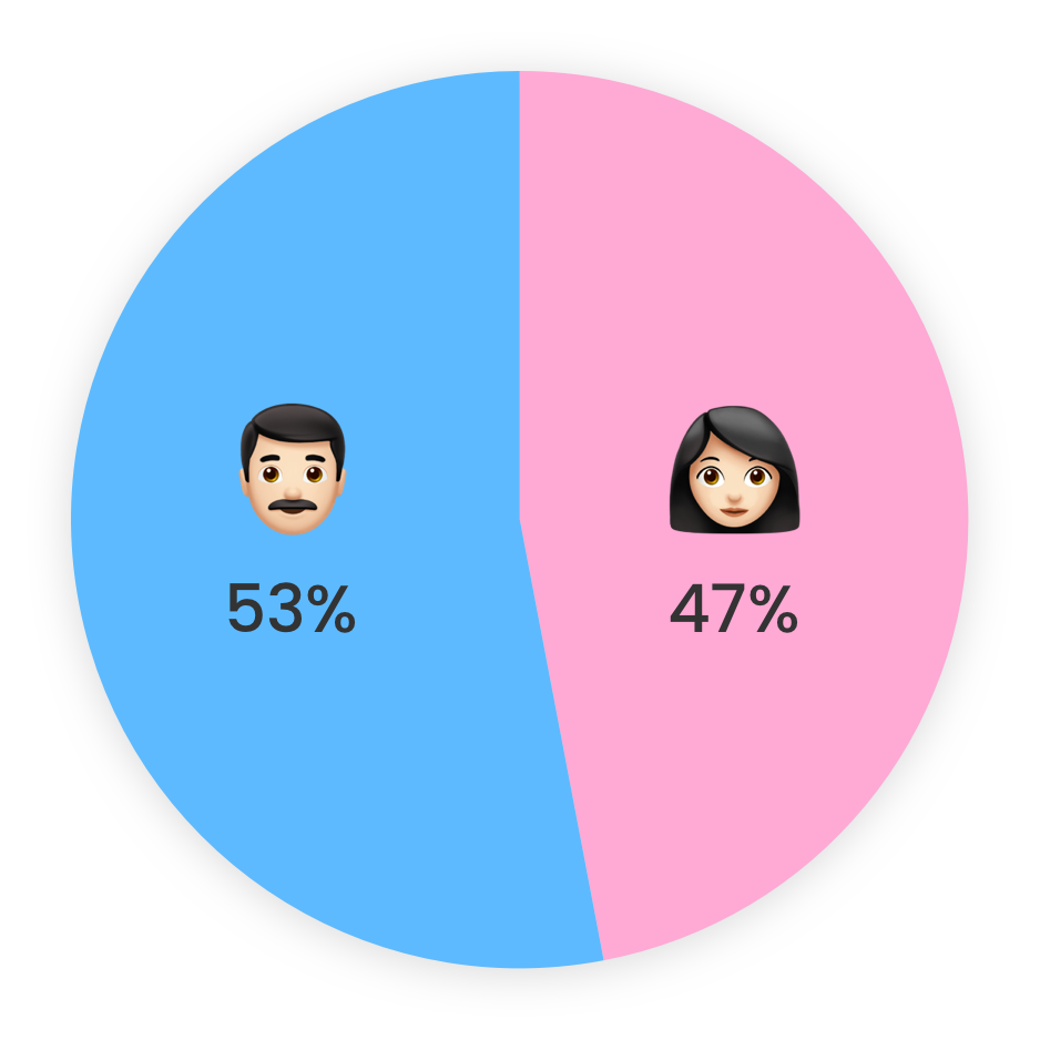
user age distribution

user City tier distribution

my team
team responsibility
In recent years, many users have been overwhelmed by the growing number and complexity of WeChat contacts. As a result, the activity of social interactions within the WeChat community was decreasing accordingly.
How might we help users manage their multiple contacts efficiently so that they could feel comfortable engaging in social activities within WeChat?
.png)
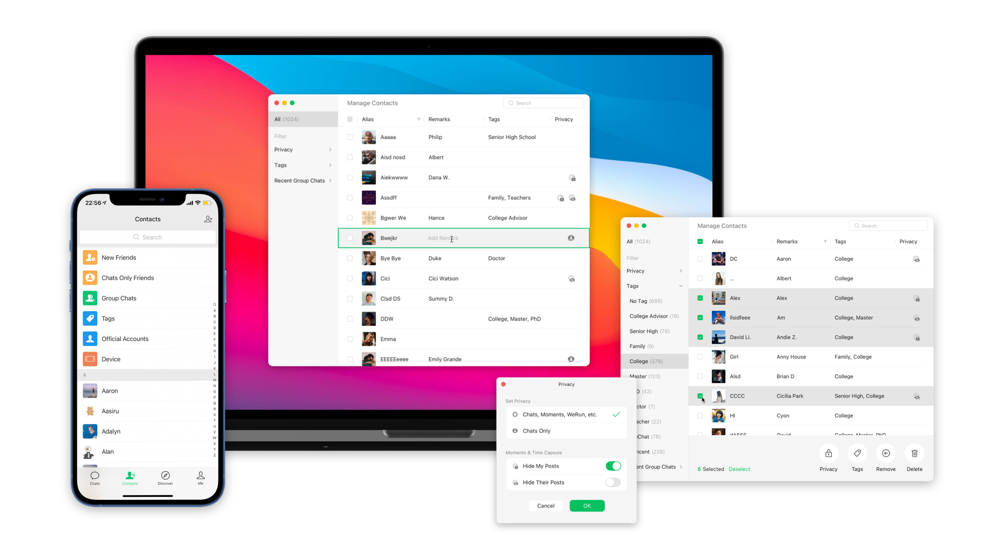
Contacts Manager is a desktop feature providing straightforward bulk management of contacts on parameters related to the activity of social interactions.
overall
Easy to find.
Simple but powerful.
You can easily find the entrance on top of your contact list. The organized structure uses a two-column design to separate contacts into lists by filters. Table design is easy to show many users with essential parameters at a glance.
privacy settings
Adjust the visibilities of social activities as you wish.
By facilitating bulk management on privacy settings, you could quickly decide who can see your activities and whose activities you want to see. You are no longer bothered by contacts you are unfamiliar with or don't want to have deep interactions with.
tags management
Share your posts only for relevant groups of contacts.
Tagging could group your friends the way you want to fasten future bulk actions. For example, if you don't want your contacts to find out that you block them via privacy settings, you can use tags to share your posts with specific groups.
editing remarks
No more confusion on who they are with a simple click.
Remark helps you recognize people and thus avoid social embarrassment. It was a nightmare if you forgot to add the remark for a lot of contacts and tried to do it on mobile. Now, you are able to add or edit the remark with a simple click.
recent group chats
Quick bulk management via existing group chats.
Before you set privacy or manage tags, handpicking multiple contacts may take a long time. Therefore, we provide you an option to select contacts from your existing group chats because contacts in the same group chat usually have high relevance.
This project was created from scratch and went public in 5 months.



1st Iteration
Many users had expressed their anxiety about growing contacts and sought to manage them in bulk in order to maintain their social images in different groups and block uninterested information.
methods
All following reports and insights were concluded from 3 research methods:

Tracking of usage data
# of samples

Online survey
# of samples

Qualitative research
# of samples
In-depth interviews: 16 of one-to-one
finding 1
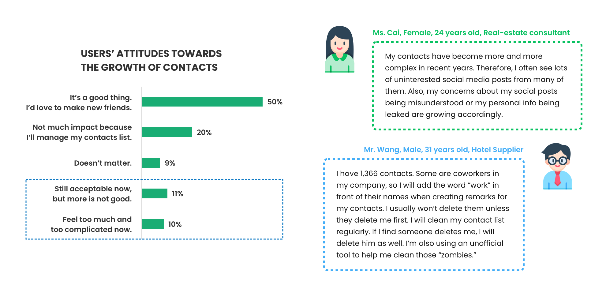
The tracking of usage data showed that the average number of WeChat contacts for each user had increased in the past 3 years. From the online survey, about 69% users perceived their growth of WeChat contacts.

finding 2
From the online survey, about 21% users indicated that the number of WeChat contacts had reached their edge of the comfort zone or had overwhelmed them. According to the in-depth interviews, many users needed to clean their contacts easily and get rid of annoying social media posts they didn't care about.
finding 3
From the online survey, users' new contacts had many diverse categories, implying the complexity of users' existing WeChat contacts. According to the in-depth interviews, users required a way to categorize their contacts so that they could easily select certain groups to share specific social activities in the future.

Defined the essential elements and outlined the basic structure of the product so that users could accomplish their core tasks of managing multiple contacts.
information architecture

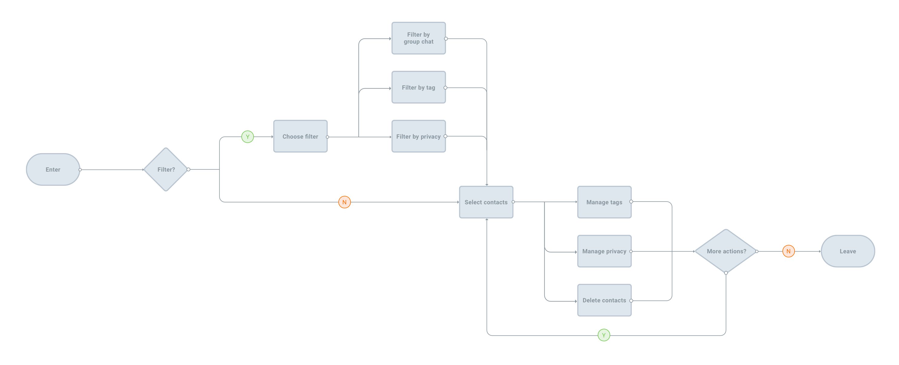
user flows
Let's show key screens for 1st round of design.

1.
Encourage users to do filter first. Tags and group chat are the two most frequently used filters.
As the research showed above, the average contact for each user was around 400. To better help users locate contacts they want to manage, placing the filter bar on the left side, where caught the user's first attention, could encourage users to filter first and then to the right side to take further actions.
Tags was the most frequently used way to group contacts within WeChat. Data showed that about 86% users had created at least one tag. Group chats was another way to differentiate contacts when users did not create tags for them.
2.
Design for managing contacts in groups rather than single one.
Contacts Manager came from the user need that users want to manage their multiple contacts conveniently. Currently, users could handle single contact easily on their mobile phones but not more than a few contacts. The advantage of the desktop as a device could quickly help users select a large number of contacts and do multiple actions simultaneously.
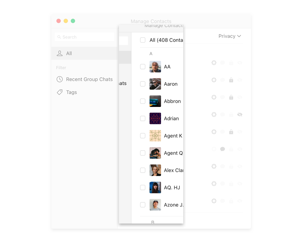

3.
Deciding who can see their posts is the most popular reason why users want to manage their contacts.
Moment, where users can share and get access to accepted contacts' information, creating an intimate and private communicating circle within the users' choice of close friends, is one of the earliest and most essential functions within WeChat.
In the past three years, users are less willing to share their posts on Moment. According to the qualitative research, some users complained that there was more and more information they didn't want to see and they were afraid of being misunderstood when posting on Moment due to the increase of contacts. The privacy of Moment was the top reason why users wanted to manage their contacts.
Thus, explicitly showing the status of Moment privacy and adding a privacy filter could help users better manage contacts based on the privacy of Moment.
4.
Editing tags and privacy and deleting contacts are the top 3 goals of managing contacts.
Adding tags, changing the privacy of Moment, and deleting contacts, were the most important actions when users manage multiple contacts. Changing the privacy of Moment here was effective for all posts on Moment. Adding tags allowed users to make certain posts only visible to specific contacts. Deleting contacts could prevent irrelevant information from showing to users permanently.

The design was in the right direction and more features could be added to make the product robust.
methods
Conducted two in-person usability testing sessions with stakeholders from design team, product team and engineering team.
high-level results
- All participants were able to complete all core tasks without extra help.
- Two-column layout visualized filters and actions very well.
- The product didn't look like a typical desktop application.
- Users couldn't change the attributes of the tag menu.
- Users couldn't learn their existing tags created previously on mobile.
- New feature needed: users had a high demand for editing contacts' remarks simply.

2nd Iteration
There were four major improvements from 1st to 2nd design to fulfill users' diverse management needs.
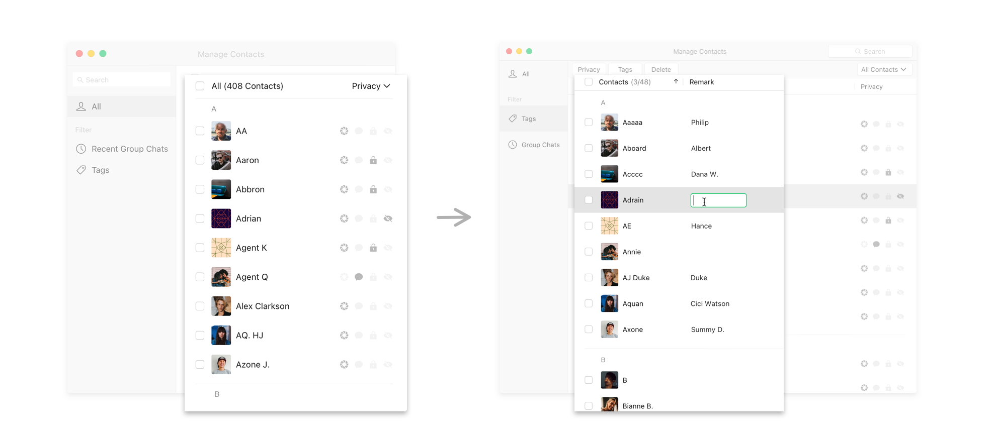
1. Edit remark with a simple click.
previous design
The column of contact's name was mixed with alias (set by the corresponding contact for all users) and remark (set by user to recognize the corresponding contact). Users had no way to edit remark on this product.
new design
Remark is an important feature that almost every user has used at least once or more. However, due to the constrain of the mobile platform, it was hard to do bulk management on the remark. Therefore, a "Remark" column was added so that users could edit the contact's remark with a simple click on the corresponding position.
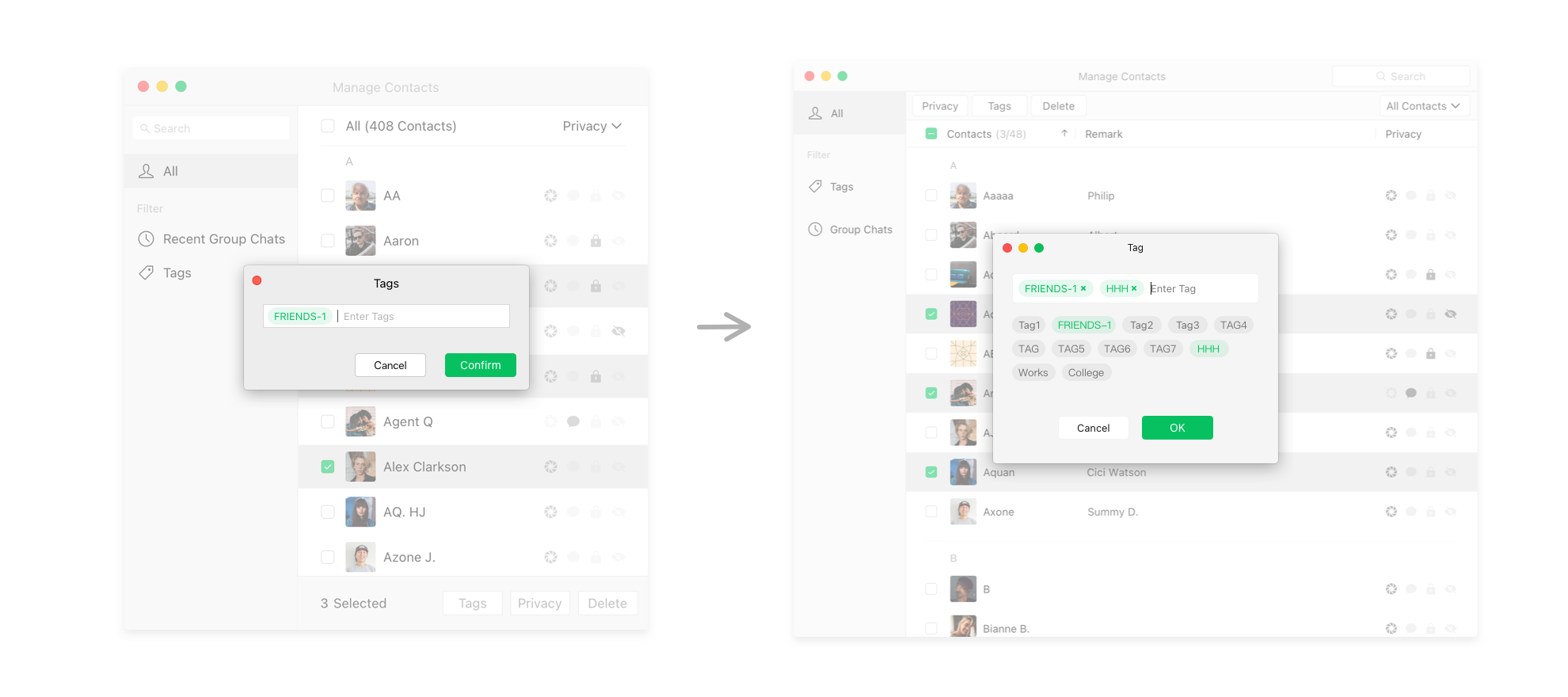
2. Improve the experience of managing tags.
previous design
Users could only add new tags to selected contacts by typing tag names. When deleting added tags, they could only use "Delete" on the keyboard and delete added tags by order.
new design
Users could add new tags to selected contacts by choosing from existing tags they had created in the past. After "x" button was added to each added tag, the delete function became more prominent, and users could delete added tag in any order.
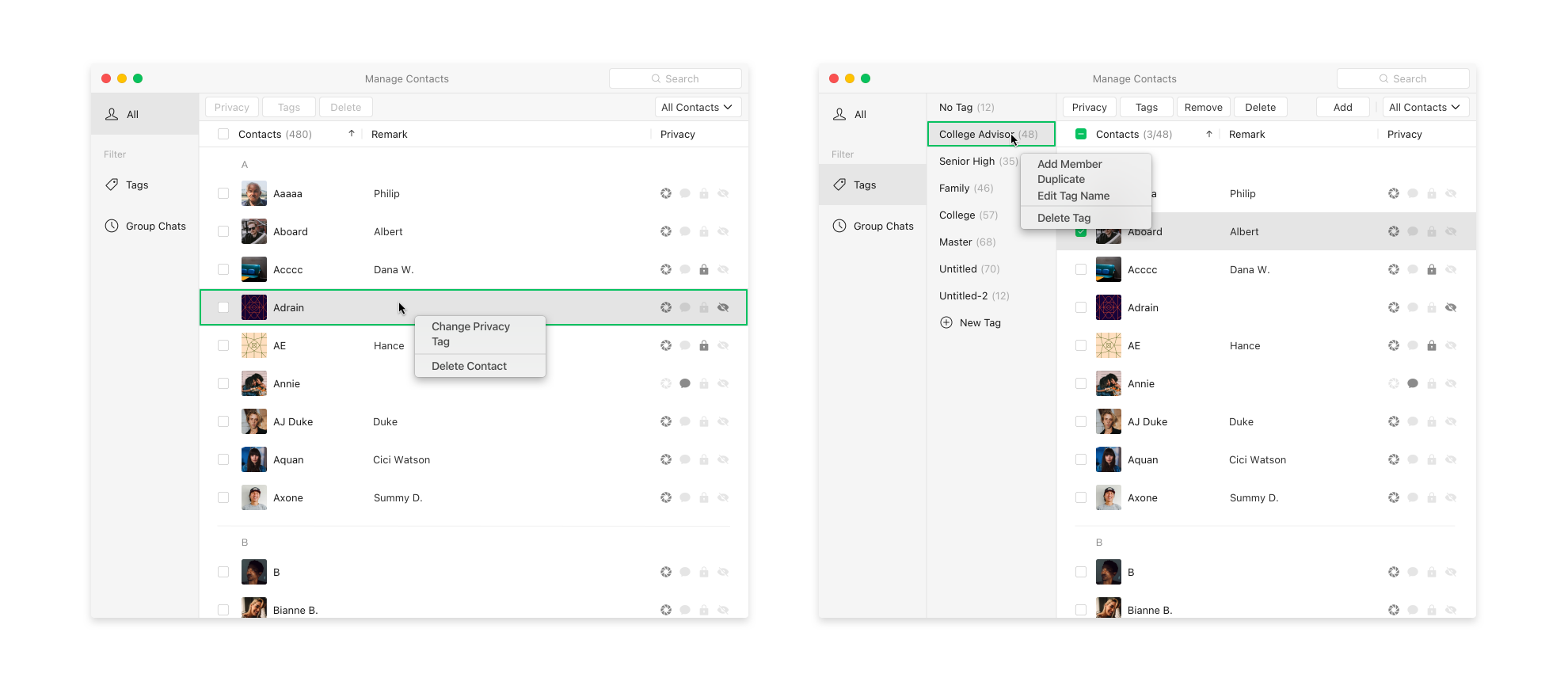
3. Add right-click menus.
previous design
There were no right-click actions. Many complementary functions were missing.
new design
One advantage of the desktop application over mobile was that we could make use of right-click menu. Many complementary functions were able to add to the right-click menu (e.g. add members to a tag group, edit tag name, or delete a tag group).
4. Combine title bar and action bar to form a menu bar at the top.
previous design
The action bar would only be shown after users had selected contacts, so it was likely that new users had no idea what actions they could take for their contacts.
new design
The action bar would be shown by default as users came in. Combining the title bar and action bar could be more organized in visual and familiar for PC users.
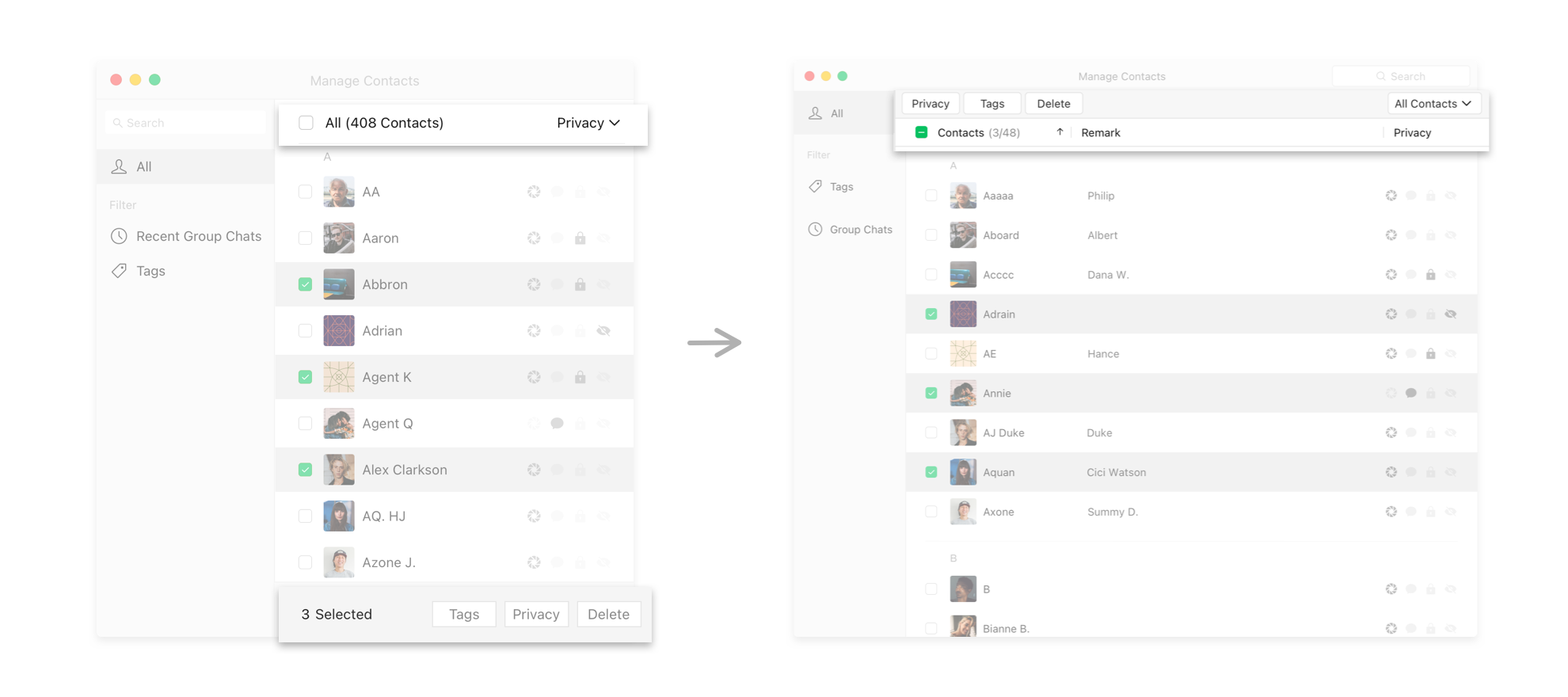
The experience was not straightforward enough and easy to use for our primary users.
methods
Conducted an in-person usability testing session with design director, product director, and leaders from design, product, and engineering team.
high-level results
- Ability to quickly edit remark was very helpful.
- Improvement on managing tags facilitated the tag management experience.
- The user flow for the core scenario was not prominent.
- Filters and actions were scattered on three different locations, so the interface became complex.
- The sidebar should help users to facilitate bulk management and it had the potential to include management for Subscriptions and WeCom in addition to contacts.
- Privacy icons were not enough distinguishable.
"Are we designing for ourselves rather than our users?"
3rd Iteration
User felt the social pressure from the increase of contacts and sought to express themselves freely and comfortably.
The fundamental reason why users wanted to manage their contacts was that they felt the social pressure from increasing WeChat contacts. Thus, they sought to express themselves freely and comfortably within the WeChat community.

Our primary users were "Rookie Managers" rather than "Senior Managers".
By revisiting the research results, I found that our team had bias when positioning the primary users of this product. We falsely envisioned our primary users as "Senior Managers," while our primary users were actually "Rookie Managers." As a result, when our primary users, "Rookie Managers," tried to use the product designed for "Senior Managers", they definitely believed that it was not straightforward enough and easy to use.
.png)
"Rookie Manager"
technology
goal of management
demand
.png)
"Senior Manager"
technology
goal of management
demand
Since we created "Contacts Manager" on the desktop first instead of mobile, we paid close attention to the characteristics of the desktop platform. We falsely assumed that our users would be familiar with computers and naturally perform advanced and complex actions on desktops. Therefore, we unconsciously envisioned our users as "Senior Managers," who had very clear management goals and organized models in their minds.
In fact, most users came from mobile because WeChat was born as a mobile product. They went to the desktop platform to manage contacts in bulk because they had to manage contacts in order to relieve themselves from numerous unorganized contacts and express themselves freely and comfortably on their online social circles.
Simplified the user experience primarily from 4 perspectives to better fit our core users and provide a simpler and more convenient experience.
1. Simplified the ways to filter contacts.
The previous design provided more than 20 ways to filter contacts by offering two dimensions of filters. However, many of them were "advanced filters" that most users would not touch. By combining two dimensions of filters into one, the overall structure of the product could be far more straightforward and clear.

Above is the information architecture for the previous design. The "Filter Bar" on the left is the 1st level of the filter. The "Sub-Filter" on the right is the 2nd level of the filter. Users are able to do 2nd level filter inside each 1st level filter so that they have more than 20 ways to filter contacts. However, according to the profile of core users and the medium number of contacts for each user is 250, I believe that offering so many ways to filter contacts is unnecessary, and simplifying the ways to filter contacts could make the experience more enjoyable for most users.
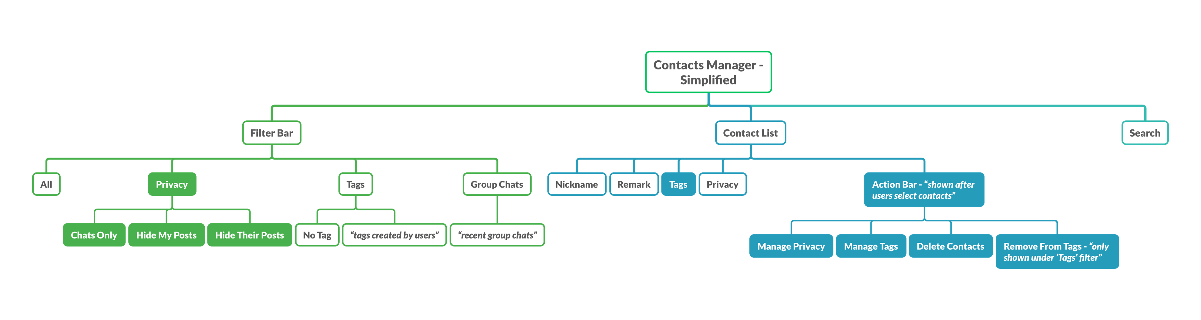
Above is the information architecture after simplification. Tags with colored background were changes compared to the previous design. The "Sub-Filter" was merged with the 1st level filter so there is only one dimension of filter in total. Most items in "Sub-Filter" were about privacy. Filters about remark were deleted because it did not belong to the category of privacy.
2. Simplified the visual movement of management.
The previous design made users feel complicated because the information was scattered out of order, and thus users found it hard to follow the flow. By changing the position of the action bar and the timing of its appearance, the layout of the information was more logical, which helped users avoid losing eye focus when managing contacts.


This is the keyframe of the previous design. Let's go over what the first-time user would most likely behave under this circumstance:
1) Users would notice the filter bar on the left and look at the right side to browse the contacts;
2) The sub-filter on the upper right corner would attract users to find what further filter options they have;
3) They look down to select contacts they want to manage;
4) Their eyes go up again to the action bar to take action.
Users who are familiar with the mobile screen would be lost in this back-and-force reading direction.
This is the keyframe of the simplified design. Let's go over what the first-time user would most likely behave under this new circumstance:
1) Users would notice the filter bar on the left and do filter first if they want;
2) They look right to select contacts they want to manage;
3) The action bar would come in from the bottom after users select contacts.
The visual movement becomes clear and straightforward, which helps users to manage their contacts more fluently.
3. Simplified a complex concept — Privacy.
"Privacy" comes from mobile WeChat, and it refers to the visibility of activities within the WeChat community to users' contacts. This concept is not easy for users to understand in a short time. However, it is crucial because it directly impacts social interactions, which we want to improve by this product. Hence, I tried to simplify this concept by its expression and the logic of its appearance.
Explanation about Privacy

This is the "Privacy" setting on mobile WeChat. There are four options of the privacy setting. This concept has difficulties in 3 aspects:
1) No matter in what language, these four options are hard to explain clearly in short, and they have similarity;
2) The interrelationship among these four options is complicated: they are not either mutually exclusive or inclusive;
3) The definition of these four options is not clear to users in the current situation.
However, since "Privacy" controls "Moments," where users share their posts and activities, we could not ignore this concept or weaken its status in our product.
Simplication 1: Expression of Privacy Options


In the previous design (see figure on the left), I used icons rather than text to express privacy because, relatively speaking, icons are more intuitive and recognizable than text. However, the premise is that the user could understand the meanings of the icons. In the previous design (see figure on the right), the correspondence between the text and icon and the association between icons are relatively weak.
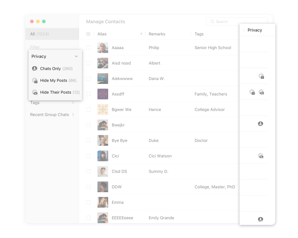

In the new design, I improved the expression of privacy icons to create a stronger connection between icons and between icon and text. "Hide My Posts" and “Hide His/Her Posts" relate to Moment, so that adding a Moment icon under them could emphasize the connection. For "Chats Only", adding a person inside the chat icon could make it more unique and enhance the meaning of "contact".
Simplication 2: Logic of Appearance
Improving the expression of privacy icons is somewhat helpful to simplify the concept of "Privacy" but directly placing the revised icons to the previous design did not make the situation significantly better:

Therefore, I tried to simplify the concept from another dimention, the logic of appearance.

To reduce the complexity of the "Privacy" column, I decided to hide inactive privacy icons and help users focus on the active privacy status. Moreover, if the contact is at the default privacy setting on the "Moment" position, the icon for this default status is no longer displayed. The new design could help users reduce interference and highlight the key status through such a selective display of icons.
4. Simplified the visual design.
Cleaner and clearer structure


Modern Visual Languages
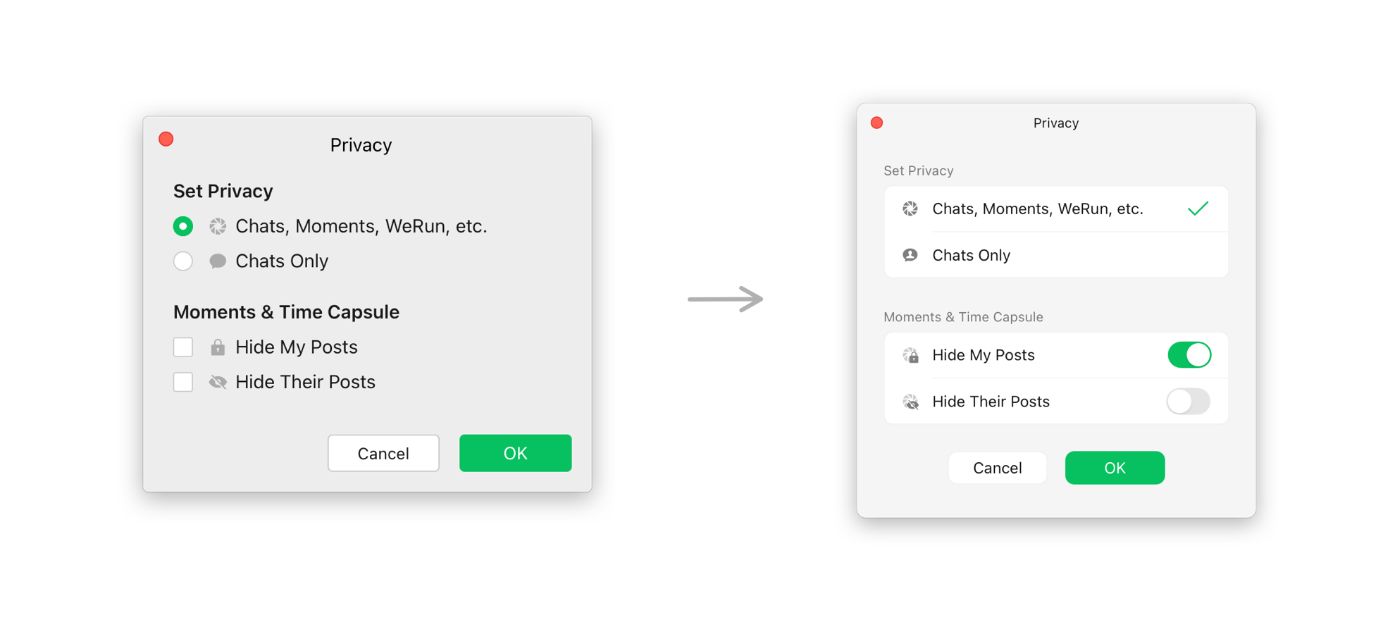
While working on this product, I contributed to improve the design system for desktop WeChat.
Designers should be meticulous in every design detail and change to work for a product with more than 1 billion monthly active users. I always came up with various designs from different perspectives before making the final decision to ensure that I had considered as many situations as possible that our users might confront under their contexts.
However, given time was limited, so developing the abilities to do rapid prototyping is significant. Therefore, I valued the idea of the design system and contributed to restructure the WeChat design system for Mac and Windows.
Textstyle Sheet

Color Palette

Altron (Single Elements)

Components (Commonly used groups of elements that can be directly used for fast prototyping)

According to the usage data and user feedback, the outcome was positive and most users indicated that it met their needs.
Contacts Manager was officially published on Oct 1, 2020, and gradually covered to all users in a week. The following data was extracted on Oct 19, 2020, which was 18 days after the publish.

Contacts Manager for Mac
Entrance Access:
16.6k
Page Views
Entrance Access:
13.5k
Unique Visitors
Manage Privacy:
18.6k
Page Views
2.7k
Unique Visitors
Manage Tags:
70.3k
Page Views
2.6k
Unique Visitors
Manage Remark:
35.0k
Page Views
1.6k
Unique Visitors
* There were 217.4k users who had login WeChat for Mac and had updated the version with Contacts Managers for the day when the data was extracted.

Contacts Manager for Windows
Entrance Access:
525.3k
Page Views
Entrance Access:
396.9k
Unique Visitors
Manage Privacy:
269.3k
Page Views
50.7k
Unique Visitors
Manage Tags:
749.9k
Page Views
36.6k
Unique Visitors
Manage Remark:
361.3k
Page Views
34.3k
Unique Visitors
* There were 25.8 million users who had login the WeChat for Windows and had updated the version with Contacts Managers for the day when the data was extracted.
Conclusion
In general, the qualitative feedback for the product was positive. Most users were satisfied with the new product and reported that this product fitted their needs.
The entrance of the Contacts Manager was not noticeable. The exposure rate of the entrance was low, and some users reported that it was not easy to notice the entrance.
Sometimes it was hard to find how to edit remarks and remove tags. The triggers of these two actions were not discoverable enough.
Many users wanted the system to help them find contacts without remarks. Although users could find all no remark contacts by ranking contacts by remarks right now, this was not the primary way to achieve their goal in their mental models.
More dimensions of privacy management could be added. Currently, the privacy management mostly controlled the privacy for Moment. As more products were developed within the WeChat community, users attempted to use Contacts Manager to manage all privacy settings for products with such settings, such as Top Stories, Channels, etc.
Users needed more filters to help them find contacts to achieve their goals faster. For example, filters such as "newly added contacts," "contacts that have deleted me," and "contacts on my blacklist" were helpful for users to take quick actions.

contact


.png)


.png)
.png)
contact
contact